HAVE A ROCK SOLID MOBILE WEBSITE

Mobile Built Right In

Faster, More Refined, and More Intuitive. As a Redframe user you will have a beautiful website that works great on all mobile devices. There are no special instructions or installations. Every Redframe website is automatically set up to take advantage of the touchscreens on your iPad, iPhone, Android, or other mobile device. Showing off your own website has never been so easy and fun!

RedFrame for Mobile Devices

STUNNING GALLERIES ON A TOUCH SCREEN

Put your business in your pocket with Redframe Mobile. Turn any smartphone or tablet into a portable portfolio. Browse your image galleries with the swipe of a finger. And with no extra instillation required, making your business more available couldn't be easier. Every gallery is automatically optimized for touch-sensitive mobile devices.

Galleries for Every Tablet Device

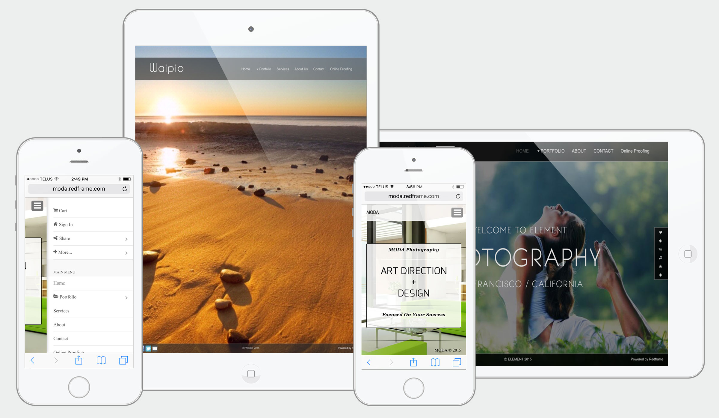
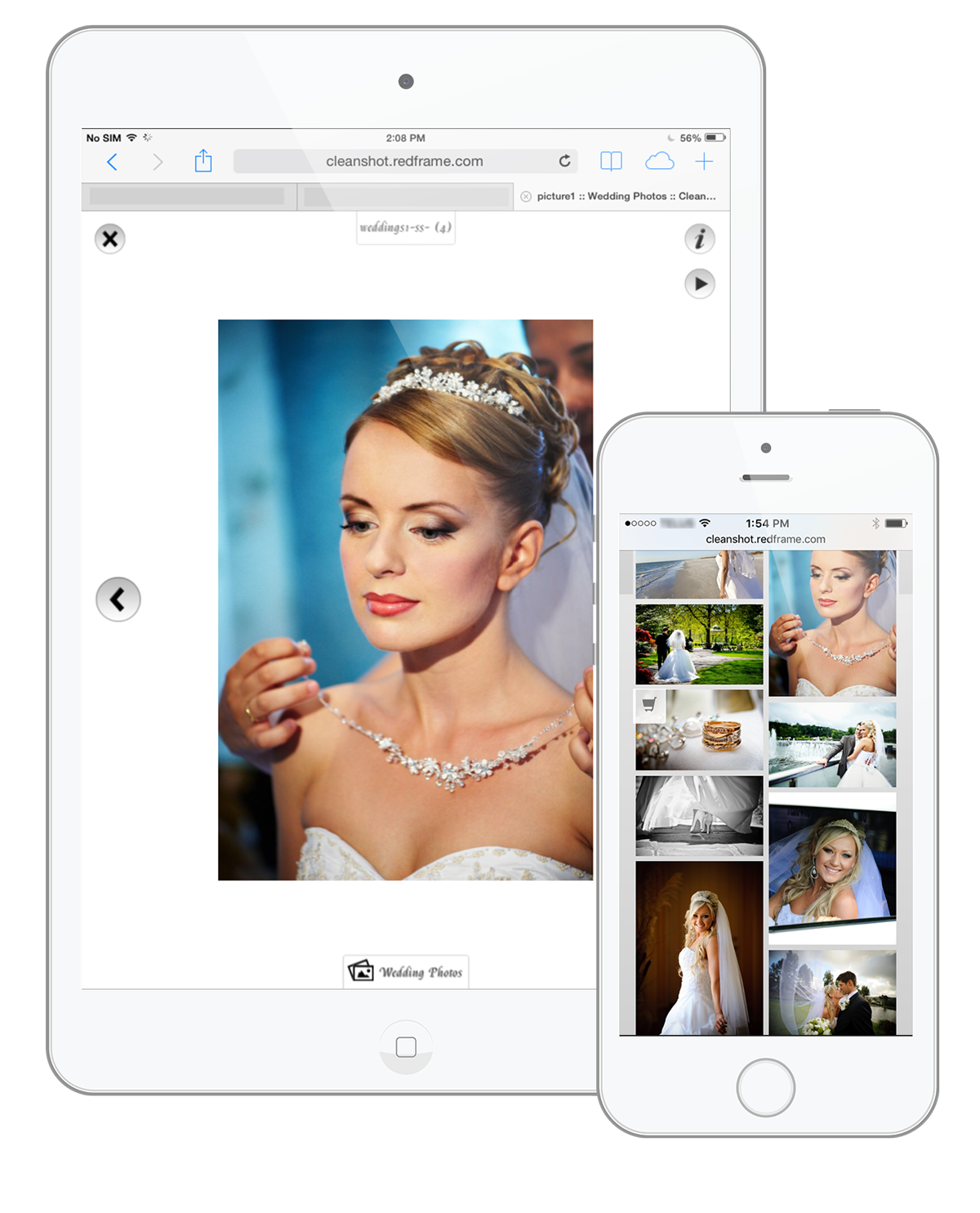
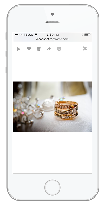
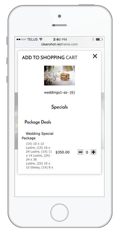
The high-definition images available on a computer are now available on your iPad and Android tablets. Use Redframe Mobile for trade shows, art exhibits, or any other event where you want to let customers view your portfolio. Navigating your gallery is simple and intuitive. Swipe your finger to scroll through full-screen images. Slide and tap the thumbnails at the bottom to jump to a specific image. Tap the info button to post comments, share on social networks, find related keywords, and even purchase prints.

Redframe Mobile galleries
Convenience and Style

Use your Redframe Admin tool to select the type of layout best for your gallery. Using the Standard Layout, your galleries will look the same on tablet devices as they do on a desktop or laptop computer.


EVEN ON MOBILE DEVICES, YOUR WEBSITE STILL SELLS

Even on Mobile Devices, Your Website Still Sells

Redframe Mobile puts your business in the palm of your customers' hands. Once set up, your shopping cart is available with the tap of the image's Info area. Your customers can order prints and pay you directly via PayPal from the convenience of their smart phone or tablet - and with no user or hosting fees, you get to keep 100% of your sales!

Redframe mobile cart

1) Customer taps Buy Now button on image or item

Redframe mobile cart

2) Customer adds image prints to the Shopping Cart

Redframe mobile cart

3) Customer completes final checkout

Redframe mobile cart

4) Customer order is placed through PayPal

YOUR SITE IS EVERYWHERE NOW

Made for Mobile.
FASTER

Redframe for mobile has been built from the ground up for optimal performance. The result is a faster loading and better-performing website on mobile devices.

MOBILE FRIENDLY SEO

'Mobile friendliness' is a major factor in search engine rankings. The new mobile update will mean that your website will not lose rankings for not being optimized for mobile.

ROBUST MENU

A robust menu system that makes it much easier for your customers to find what they are looking for. Your visitors can browse your site with one hand, or even one finger.

ENHANCED E-COMMERCE

The mobile online store has is optimized so that your customers can more easily select and pay for their image purchases directly through their phones.

START YOUR FREE TRIAL TODAY

No Credit Card Required